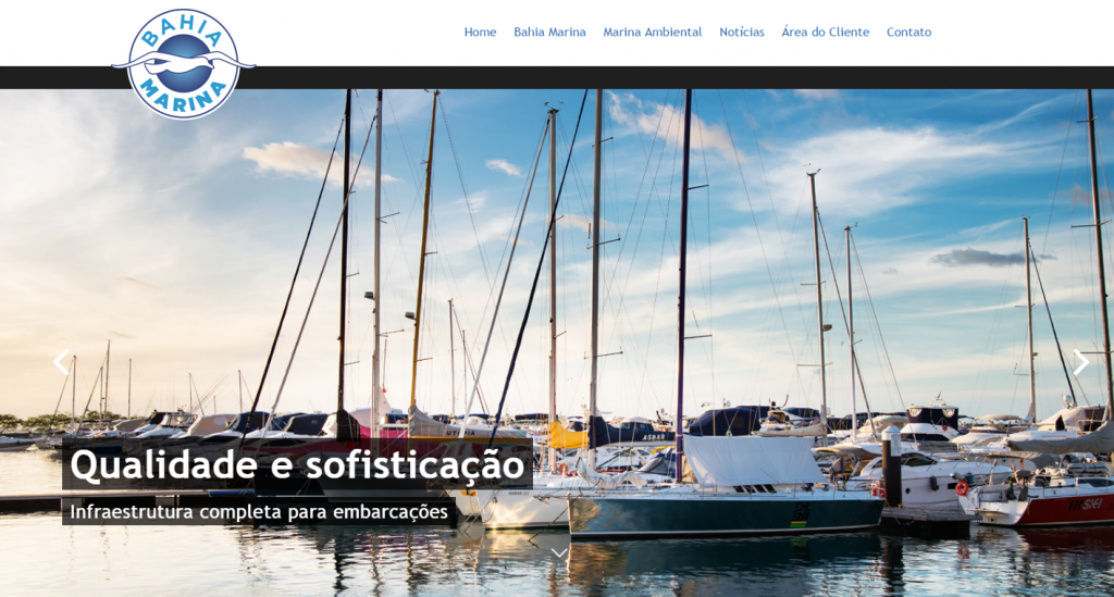
As a magazine ready to be flicked through, the new Bahia Marina website presents a new designed layout. More practical and modern so clients and visitors can easily access the information and services, infrastructure, leisure and all news about the nautical world.
The page shows beautiful pictures of Bahia Marina as a Salvador postcard, all pictured by photographer Tarso Figueira. The company also believed in the change of its logo, with stylised traces of the seagull, palettes along with current and lighter fonts.
Accessing the website, right on the homepage, visitors can enjoy images of Marina, such as the sunset, boats at the piers, green areas and restaurants strategically located with a beautiful view of the sea.
On other navigation menu, information on the capacity of spots, safety, parking lot, companies inside Bahia Marina, news and general info for visitors and clients.
From now on, besides news about Bahia Marina and its environmental education and social communication program, the new page brings contents related to the nautical world, a new way of share information about this field. Still in the first semester of 2017, the website gets one more language, with all its contents tranlated into English, being able to be accessed by clicking on the English indicative section.
Accordig to Bahia Marina Commercial Manager Silvia Ferreira, the new website was projected to be compatible with different browsers and platforms, including mobile devices without losing navigation quality.
New logo
Created and redesigned by Engenhonovo Agency, Bahia Marina logo got more lightness. According to the creative staff, the typographic family chosen was Gotham, bringing simple and objective traces in its DNA, extremely geometrized and with a great variety of styles. The colour palette could not be different from the sky blue and sea blue as a traditional Bahia Marina signature, creating a unit of communication for all brands of the group and a better perception from its variety of audience.
Finally, the stylization of the new seagull trace was made. In a very brief way, the character was recreated, balancing the height and the wings, letting them more symmetric, leaving behind the black thin border that, sometimes showed some difficulty of technical reproduction.
The new company logo takes the signature of the Creative Director, Marcio Sant´Ana, Art Director Hugo Espínola and attendance support, João Almeida.


